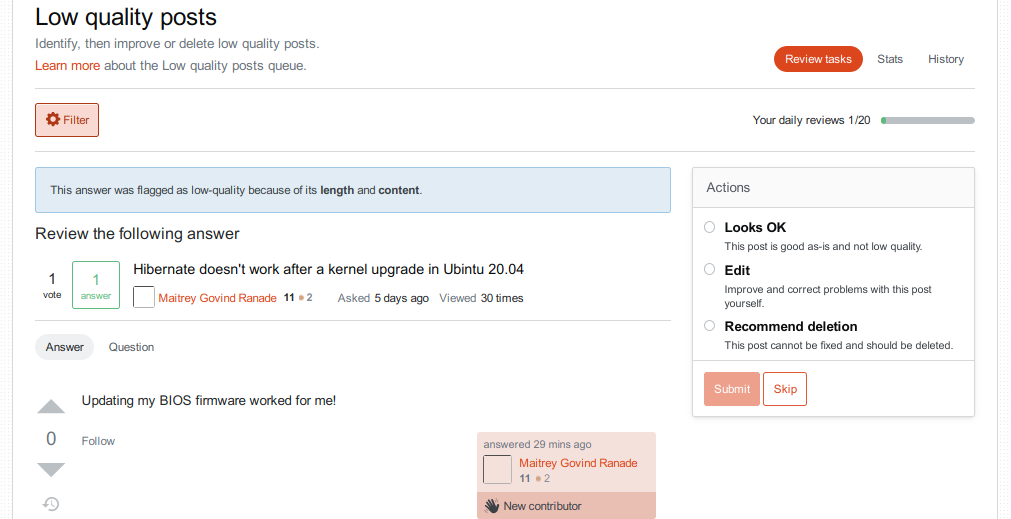
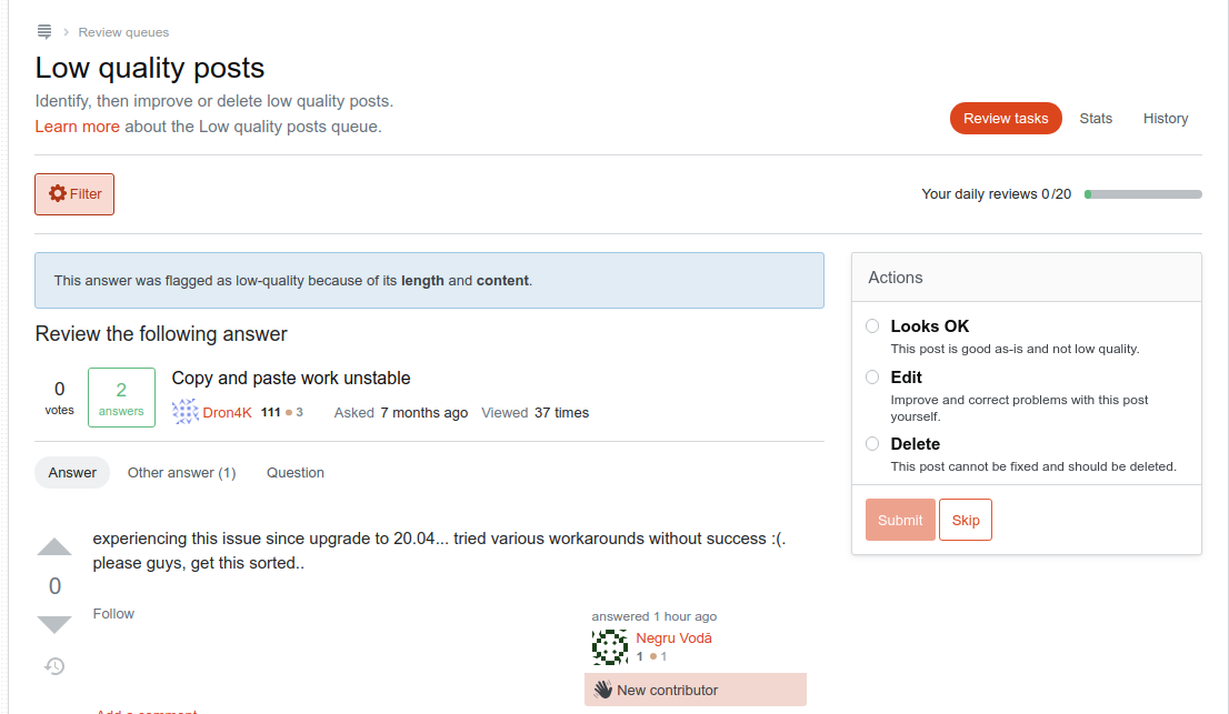
I'll post an answer since it's hard to do in comments. I will be using this review item as an example: https://askubuntu.com/review/low-quality-posts/1123857

Now, on to your specific points.
-
identify post: the banner at the top shows very prominently infos about the question (which is totally irrelevant when reviewing an answer)
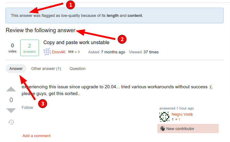
I honestly don't understand this. The banner clearly states answer:

And the same information is further reinforced. In total, there are three places where the system is telling you it is an answer:

I really don't understand what else is missing here.
-
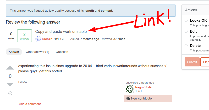
link: where? I have been trying to find it just now for several minutes
The question title is a link:

Now, this takes you to the question page and does not immediately scroll to the answer. If that's what you meant, I do agree that it should be improved. However, I find that with the new interface you don't need to actually go to the question since everything is already here. In any case, the old system also took you to the question and not the specific answer, if I remember correctly, right?
-
real estate:
the "actions" window covers the place where the link to the post in question used to be
This one I don't get at all. The link to the question is still there, as explained above, and now I have the actions in a nice clear box easy to access and clearly visible. Removing it would just leave empty screen. Why?
I am not able any more to see the answer and the question at the same time
Yes, OK. I don't particularly miss that myself. For one thing, that was only possible when both the question and the answer were both tiny enough to fit in one screen. in most cases, the old system wouldn't let you see both at the same time without scrolling anyway.
However, this does seem to contradict your initial complaint about having too much information about the question which you said is "totally irrelevant when reviewing an answer". You seem to be both wanting more from the question and less.
Personally, I find that in the vast majority of cases I can either review the answer without even checking the question (link only, clearly bad etc), or I can just read the question once and that's enough to make a judgement on the answer. Since they usually don't fit in one screen anyway, the new interface makes it much easier to consult the question while reviewing the answer.
So, in all, I just don't see most of the problems you mention, myself. This seems like a clear improvement which has fixed many of the long standing issues with the review.

