16

On AskUbuntu there is similar background-formatting for Blockquote text and Preformatted code text.

Example-1 (with preformatted/coded text):

sudo apt-get update

Example-2 (with block-quoted text):

sudo apt-get update

The similarity makes it easy to confuse them.


In this example

Try first sudo apt-get -f install so that...

The code sudo apt-get -f install is not easily picked out because of the whole-statement's block-quote format.

It should be easier to differentiate these types of formatted text.


On other S.E sites there is a different colouring to the background which makes it easier to see the difference. Here's an example

screen

I'm not asking for it to be exactly like this, but some differentiation is definitely needed here on Ask Ubuntu.

4
  • 4
    strange, wasn't the code a darker color before?
    – Mateo
    Commented Jun 17, 2014 at 15:21
  • 1
    @Mateo It does have a slightly darker color on main (Example), but not on meta (Though I'm not sure if this was the case before). Either way, I prefer how a blockquote looks very different from a code block on other sites.
    – Dan
    Commented Jun 17, 2014 at 16:24
  • oh, that explains it, I think the difference used to be greater as well
    – Mateo
    Commented Jun 17, 2014 at 16:33
  • I wonder what have happened to this, is there no official statement somewhere? I think this would be really useful to have them really distinct from code lines.
    – Videonauth
    Commented Dec 13, 2016 at 18:37

3 Answers 3

12

I think We should adopt the color background quote style with the vertical rule as:

  1. It is clearly different
  2. It would help with the confusion of formatting code as a quote.
  3. We could use a light aubergine consistent with Ubuntu colors:

enter image description here

enter image description here These might be too dark.


enter image description here

5
  • 1
    Not sure about it being aubergine though...
    – Tim
    Commented Jul 30, 2014 at 10:01
  • @Tim - perhaps the colour could be set in user preferences :D
    – Wilf
    Commented Jul 30, 2014 at 13:14
  • Yes, possibly :) I think the yellow is better - or see my suggestion at the bottom - no colour change.
    – Tim
    Commented Jul 30, 2014 at 13:15
  • 1
    Maybe a Light orange? Oh, The grey with the rule looks good as well.
    – Mateo
    Commented Jul 30, 2014 at 15:15
  • Yeah, I prefer the grey, I think they colours breaks the colour scheme...
    – Tim
    Commented Jul 30, 2014 at 20:42
4

I would suggest that we keep the same colour for the quote, but instead just add the rule along the side.

I took the line colouring from the yellow one on Meta.SE- it goes from (33,255,241) to (35,255,199), a change of (2,0,-42) so I did the same with the grey, from (0,0,238) to (2,0,196). These are all HSL colour numbers.

I also think that the code should change colour, maybe to be slightly darker than the quote, so that you can see a difference when there is quoted code:

This is a quote. This is embedded code. Not much difference.

The embedded code background is #dcdcdc. This could possibly only happen when it is embedded in quotes? But a permanent change wouldn't be bad.

My pronouns are He / Him

1
  • 1
    Yes, this is a nice middle ground. I sometimes find the background coloring of the beta sites to be very glaring.
    – Seth Mod
    Commented Aug 1, 2014 at 3:52
2

I think having a different color for blockquotes and code makes sense, because they serve two different purposes. As you've shown sometimes you may have code inside a blockquote, and it would be nice to be able to visibly distinguish it. I would suggest staying away from highlighter colors since to me they say this is the important part not this is the quote, but I might be a bit biased on that since I would actually like to see a highlighter feature implemented. The code wrapper is actually kind of like highlighting except it as well stays away from highlighter colors to distinguish that it's for code.

There is a forum software called Simple Machine Forums which I think has a nice quoting setup; perhaps we could take a page from their book. You can find some examples on this page: http://www.simplemachines.org/community/index.php?topic=523494.0 . Here is a screenshot of one:

Simple Machine Forums Quote Example

As you can see above, on S.M.F. their postings have a gray background so their quotes have a darker grayish-purple color. This makes them stand back, but different from highlighting which makes things pop out. I'm not saying we should use the same purpeish-gray color on here, because our background is much lighter than S.M.F.'s. AskUbuntu has a white background so perhaps a medium gray would be an equivalent to the S.M.F. strategy? I also think having quotation marks would be an asset to help make it clearer that it is a quote.

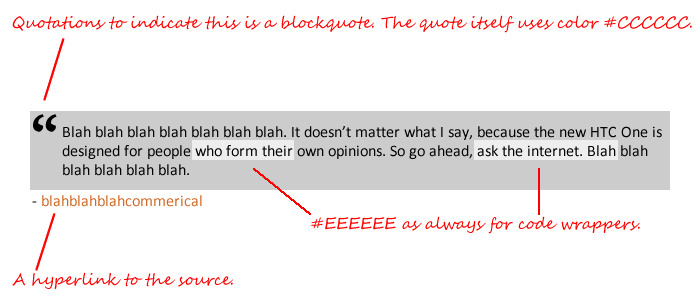
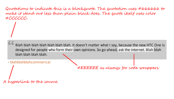
Currently both blockquotes and code wrappers use #EEEEEE, but I think blockquotes should perhaps be switched to #CCCCCC so they fall back. As seen in my examples below. Please ignore the misuse of the code wrappers, I couldn't think of anything to type.

Example #1:

Example One Of Blockquote And Code Wrappers

Example #2:

Example Two Of Blockquote And Code Wrappers

2
  • 1
    The problem here is that blockquotes are not always used for quotes - like code blocks are not always used for code, bullets points etc. Would be nice a form of formatting though.
    – Wilf
    Commented Jul 30, 2014 at 13:16
  • Plus the big quote is pretty tacky.
    – Jason C
    Commented Aug 1, 2014 at 19:29

You must log in to answer this question.

Not the answer you're looking for? Browse other questions tagged .