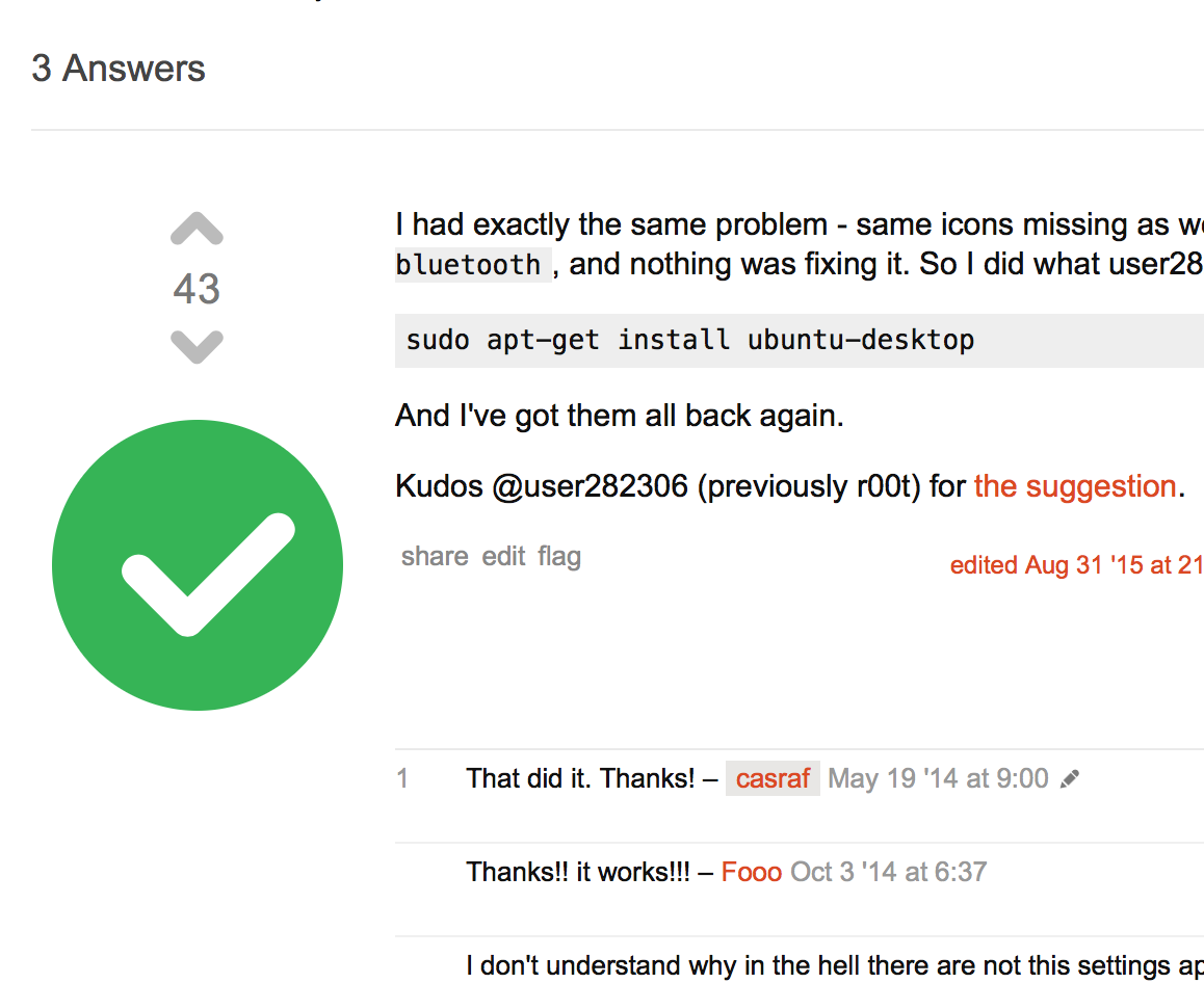
-12

Judge yourself.

Compared to the size of the voting buttons and score, it's unusually (unlike the checkmark on other Stack Exchange sites) large.

I'd consider this to be a bug. If it's not a bug, then it's a feature request.


<sarcasm>If the purpose was to show off the checkmark though, apologies. Then you should probably enlarge it, as suggested by bjb:

</sarcasm>

8
  • 1
    Well . . .why is it bad ? People can see that it's the accepted answer easily, and besides consider people with limited vision Commented Jan 10, 2016 at 21:01
  • @Serg It's not inline with other sites of Stack Exchange family. Take this answer on Meta Stack Exchange as an example of the normal-sized checkmark.
    – nicael
    Commented Jan 10, 2016 at 21:03
  • 3
    I'm no moderator, but each site has their own designs for small details like that . I've just jumped from this to this and then to this. So your point that it's not in line with Stack Exchange family doesn't make sense. All of those sites have different design for check-mark button Commented Jan 10, 2016 at 21:07
  • 1
    @Serg Android has a pretty small one, worth reporting too. Though most of the sites have the voting buttons and the checkmark sized equally.
    – nicael
    Commented Jan 10, 2016 at 21:12
  • 4
    your example in comments - the check mark is the exact same size as ours pixel for pixel: i.sstatic.net/TeDEs.png
    – Mateo
    Commented Jan 10, 2016 at 23:49
  • @Mateo the voting buttons are too small then.
    – nicael
    Commented Jan 11, 2016 at 18:02
  • 3
    I don't see anything wrong with ours' size; it is proportional to everything else perfectly and there is no issue with it being "too big" or "too small"; everything works fine and fits fine even on small screens... so why is this an issue?
    – Thomas Ward Mod
    Commented Jan 11, 2016 at 19:12
  • @Thomas You can obviously disagree; it can be just me.
    – nicael
    Commented Jan 11, 2016 at 19:13

1 Answer 1

4

TL;DR: I disagree with the OP, and believe the current UI works for this site (that is, the Green Answer Accepted checkbox circle is fine); therefore, we do not need to be having everything aligning perfectly to a set size, nor do we need to even be discussing this issue further...
(This last part is obviously my own opinion, regarding this discussion not needing to go further)

I disagree with you, and believe there is nothing wrong.

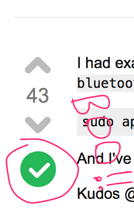
Here's a zoomed in snippet, plus two black lines to show in-line size of the checkmark itself:

Snippet, askubuntu.com Answer UI

Here's what I see:

  1. The check box itself is slightly off-center from the rest of the buttons - that is, the checkmark itself.
  2. The green circle for an "Accepted" answer is slightly outside the size of these black lines... but only just so. I don't see an issue with this, namely because the green circle has spacing between its edge and the checkmark itself to not look crazy weird.
  3. The green circle is there for emphasis. It's done this way so people KNOW the answer is accepted (the green and white checkmark on the white background draws that emphasis).

This issue you've stated would only really apply if it were a case of the entire checkmark image itself being too huge - the checkmark itself is fine, the emphasis circle is slightly larger, but not such that it impacts UI.

Now, if this were on the Science Fiction and Fantasy site, then this would be an issue if the checkbox image itself were this way, and because I'm insane, here's a snippet from the Science Fiction and Fantasy site to give a comparison of why it would look really 'weird' in that case:

Snippet, SciFi.stackexchange.com Answer UI

The SciFi page uses circular buttons anyways - which means it must flow in line there (the black lines are my own). Both of these are zoomed in. But if we zoomed out, we'd see a case of our green circle not really going far outside the lines anyways - thereby not causing a substantial UI impact.

My belief is the green circle fits fine into the current UI of Ask Ubuntu. We do not need to change it, and the slightly-larger-than-the-vote-buttons green answer-accepted circle is fine.

2
  • Hm, actually it may be an illusion, because of the checkmark being trapped in the circle unlike the voting buttons.
    – nicael
    Commented Jan 11, 2016 at 19:33
  • @nicael My belief is that it is an illusion; the checkmark IS trapped in the circle, but if you look at other sites that have a checkmark and no other emphasis, it's that much harder to determine (at least, as the person ASKING the question, and choosing an answer to accept) which is actually accepted or not; by having the green-circle-enclosed checkmark we bring that emphasis to the asker, and indirectly, to the community to see which was actually selected as the answer.
    – Thomas Ward Mod
    Commented Jan 11, 2016 at 19:37

You must log in to answer this question.

Not the answer you're looking for? Browse other questions tagged .