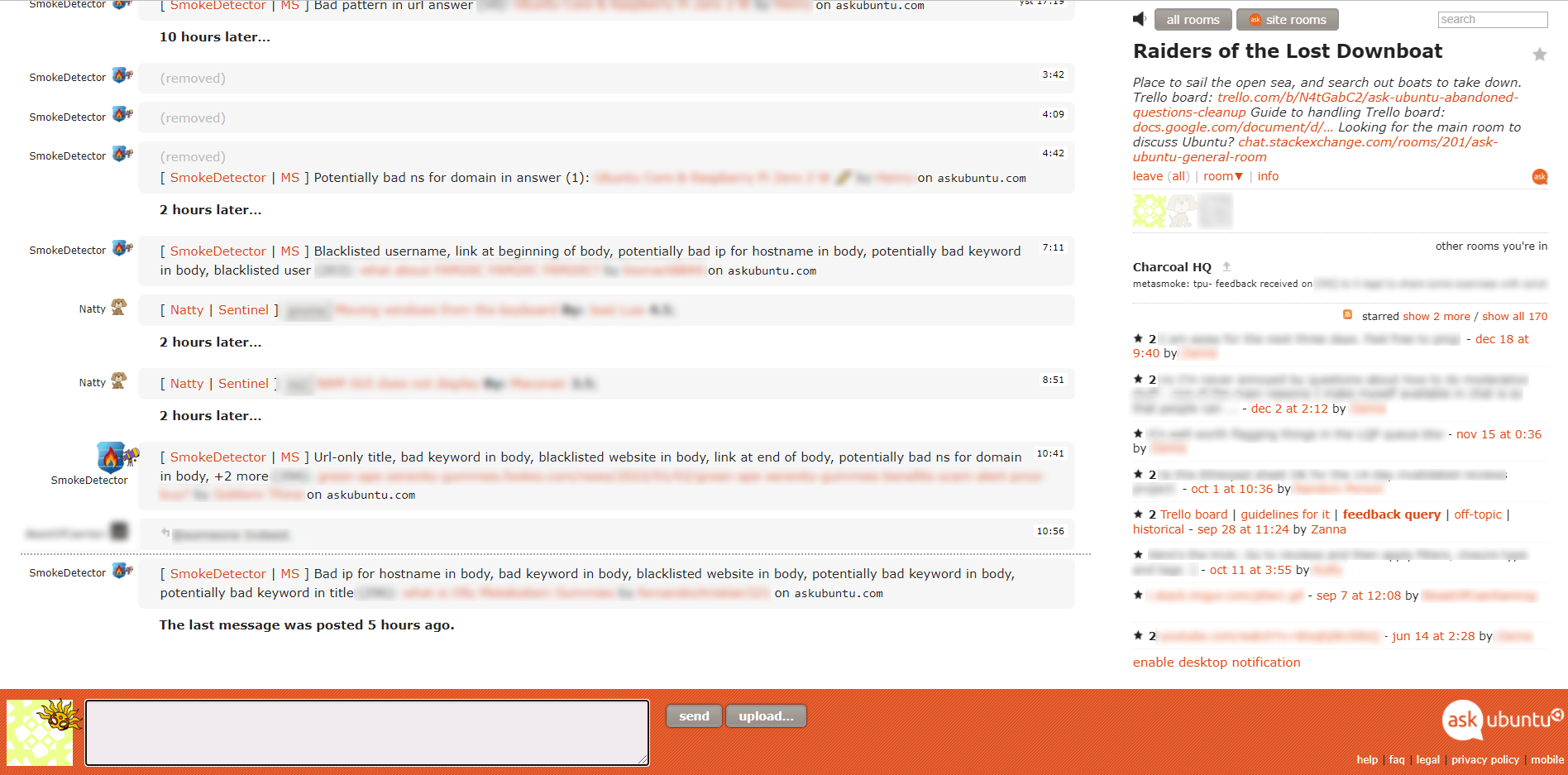
Chat has never been a priority for SE but if that changes and they decide they want to put some work into it, then I would say that the absolute least important thing to do would be this kind of purely cosmetic changes.
We have real issues with chat moderation, the way it is split across servers in some cases (MSE chat, SO chat and SE chat), the way it is not split between sites so that problems on one site become problems in another (which can be a good thing or a bad thing, depending on the situation), the way flags are shown to all users, including those who don't speak the language of the flag and all sorts of other things.
The actual chat mechanics are, for me, the best I have ever used. I love the SE chat engine, specifically the ability to easily reply to messages, and the simplicity of it combined with the glorious lack of emojis. The UI is OK, maybe it could be improved (but please not by making buttons look like not-buttons!), but that seems like a very, very low priority.
So my vote is for leaving the interface alone and if any work is to be done, that should be to add/improve actual features and not just a facelift.
That said, I admit I also personally disagree with a lot of your suggestions:
- Change the orange bottom bar where I put my message to be a solid color. That pattern is from 2012. On the Ask Ubuntu site, it uses a solid color, and I think chat should be the same:

Yeah, OK, sure. Seems simple enough and harmless. I kind of prefer the current pattern, but I don't have any strong feelings either way.
- The bottoms (
all rooms, [ask] site rooms, send, and upload...) should be matte (i.e., not 3D). See this UX SE question for some examples of that.
No, no, no, please no! These are buttons. They should look like buttons: clearly 3D and clickable.
- The "put your message here" textbox should be the same style as the "Add a comment" one:

It already is, isn't it? One of these is the chat text box and the other is the comment text box. I


The only differences I see is the background color and the text in the box itself. Do you mean you want the drop-shadow around the box that appears on the site? How would that work on an orange background?
- Tags should render like they do on Meta (
 vs. gnome
Tags already do render that way. You just need to write them as [tag:foo] in chat. See https://chat.stackexchange.com/transcript/message/60051570#60051570:

- The mute icon (top-right, left of
all rooms) should probobly be updated to have the same style as the rest of the SE icons. The RSS icon should also be updated to have a matte theme.
I don't see any benefit in changing the mute icon. It seems fine and understandable as it is. And the SE icons in general are very unclear and confusing (e.g. the ones on the top of this page where we need to somehow guess what each icon is supposed to represent). Why would we change a clear, familiar and instantly recognizable icon (see below) to something else that we would then need to train users to recognize?

I don't actually know what the "RSS icon" is, but I also am not a fan of matte (if that wasn't clear so far! ;P) so I doubt I would personally be in favor of changing it.
In summary, I would argue that this sort of cosmetic change would be a waste of developer time and if they want to put any effort into chat, there are loads of important, functional changes that should be prioritized over minor things like changing the aesthetic from something already good to something that could maybe be prettier, but could also be uglier. Sounds like a lot of work for negligible (if any) benefit.


 vs. gnome


