41

I got the following notification inside my inbox:

Edit suggested

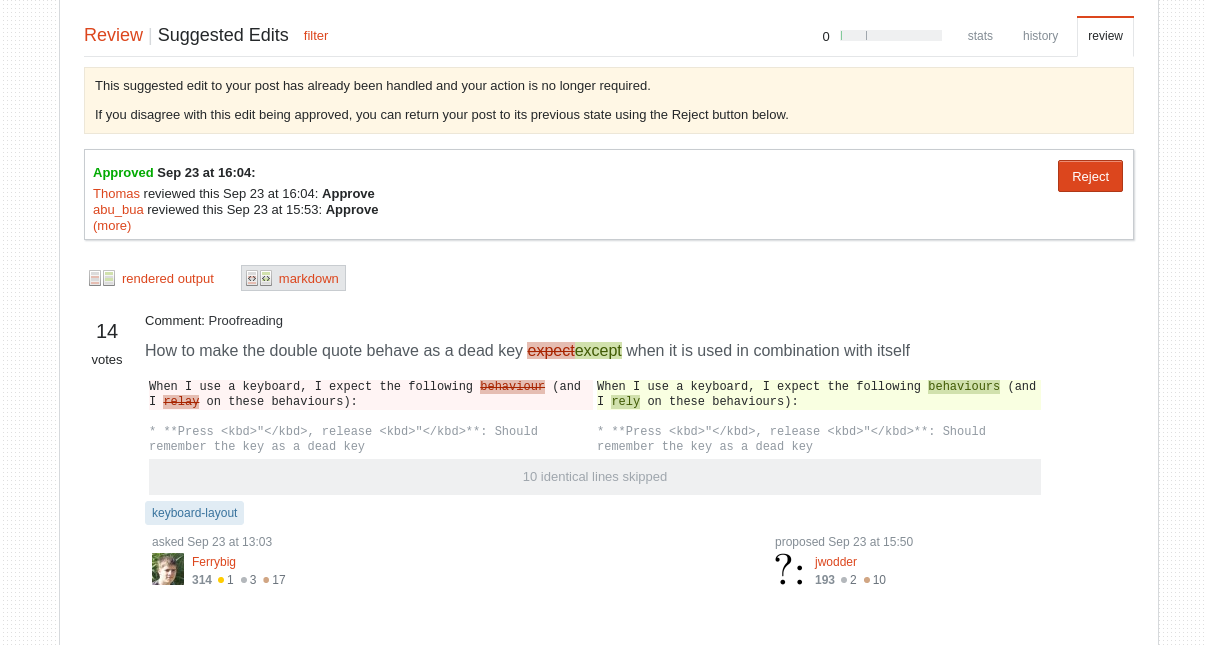
I clicked on the notification and got to the following page:

https://askubuntu.com/review/suggested-edits/880858

Because it was an edit suggestion to my own question, and it was already approved, the UI only showed 1 button.

enter image description here

Because the UI only shows 1 button, I though instinctively that it was an "ok" button, but just before I pressed it, I saw that the actual text was reject.

While I avoided the "disaster" in my case, I can quickly see how someone with less attention may confuse the button for an "okay" button, and press it accidentally.

I think we should improve the sites UI to make this confusing less large

2
  • One option would be to display an "OK" button but make it disabled. (Additionally, on hover it could show a tooltip explaining why it is disabled.) Commented Oct 4, 2018 at 8:08
  • 2
    @joeytwiddle, or just an enabled "Looks OK to me", or "No action needed" button. Even though it doesn't actually require an action from the post author, having the chance to confirm that they don't want to do anything about it wouldn't seem wrong.
    – ilkkachu
    Commented Oct 6, 2018 at 9:48

2 Answers 2

2

Yees, I'm totally agree! When there is only one button, usually it is a Confirm (positive action) button. The first time, when I opened the screenshot, I didn't read anything, I just saw Next or Skip button or something like that.

Something more it sounds or looks like this case is against the latest SE's policy of kindness. Here we can't agree with the community's meaning and can't contribute to it by further improvements.

IMO, the standard Review|Suggested Edits form, which has all the necessary features, should be applied here.

enter image description here

Just a notice to the moderators: This question currently has 35 up-votes here, it, probably, will be more worth on Meta SE.

2

The second line of text in the yellow box above the review area is supposed to explain what you're doing in this case, though I can understand if a lot of people skim it in preference of the bright red buttons.

A brief explanation, for those who may be unaware (skip past the bullet points if you're familiar with this):

When you are the person whose post has been edited through an edit suggestion, you have the option of overriding the review process in either case (assuming the post hasn't been edited in the interim).

  • If you think that approving the edit was correct, you need do nothing at all.
  • If you think that approving the edit was wrong, you reject it - which rolls back the edit to the previous version and subtracts two rep from the person who suggested the edit.
  • If you think that rejecting the edit was correct, again, you don't have to do anything.
  • If you think that rejecting the edit was wrong, you reject the rejection of the edit, thus reinstating it and granting the person who suggested it the 2 rep for doing so.

So, what we may need to do is change the button to say something that relates more obviously to the review, not the edit, as that's what you're actually rejecting/approving.

Perhaps two buttons (with helpful tooltips):

  • accept review (accept the outcome of this review, either approval or rejection)
  • override review (override the outcome of this review, either approval or rejection)

We could then reword the yellow box to say something more like:

If you agree with the edit being approved/rejected, click "accept review". If you disagree with the edit being approved/rejected, click "override review".

Having both options also lets the OP specifically weigh-in on the edit in both cases and effectively "closes" the issue.

You must log in to answer this question.

Not the answer you're looking for? Browse other questions tagged .