I got the following notification inside my inbox:
Edit suggested
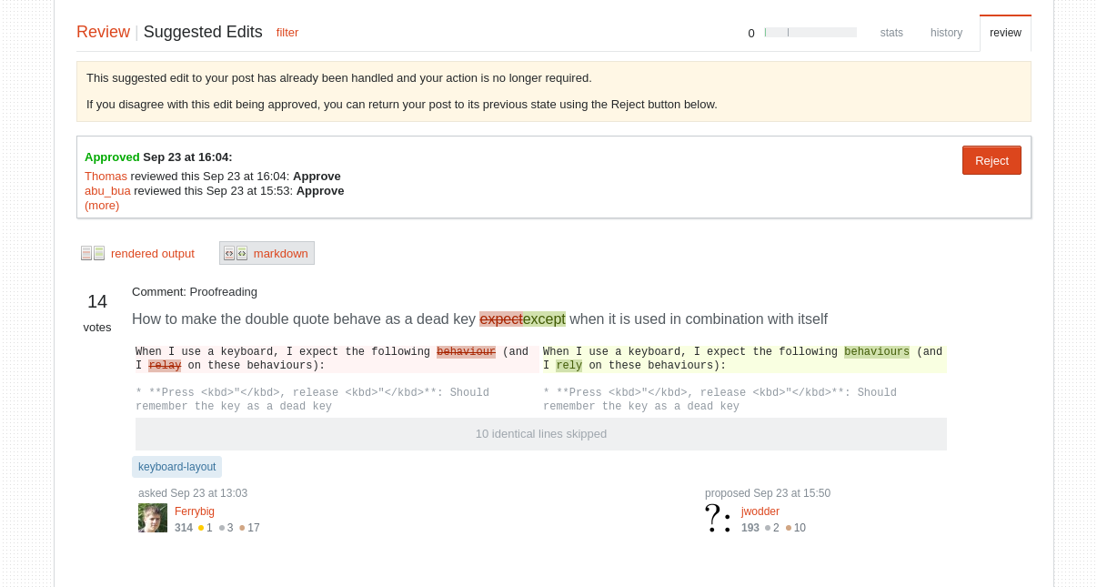
I clicked on the notification and got to the following page:
https://askubuntu.com/review/suggested-edits/880858
Because it was an edit suggestion to my own question, and it was already approved, the UI only showed 1 button.
Because the UI only shows 1 button, I though instinctively that it was an "ok" button, but just before I pressed it, I saw that the actual text was reject.
While I avoided the "disaster" in my case, I can quickly see how someone with less attention may confuse the button for an "okay" button, and press it accidentally.
I think we should improve the sites UI to make this confusing less large


