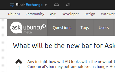
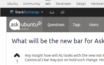
Any insight how will AU looks with the new not-technically-black bar? IMHO the integration with Canonical's bar may put on-hold such change. How will the bar be integrated with the current UI?
-
5The new bar? We're raising the bar! (sad_trombone.mp3)– Nathan OsmanCommented Dec 4, 2013 at 22:28
-
2I would wait till see an astonish design from Mateo. Classic..– LucioCommented Dec 4, 2013 at 23:12
-
2For reference: blog.stackoverflow.com/2013/12/a-new-top-bar-for-stack-exchange– andrewsomethingCommented Dec 5, 2013 at 18:26
-
5Funniest comment on the blog post: "It’s like Gnome3. 'Letting you do less in more clicks'"– andrewsomethingCommented Dec 5, 2013 at 18:26
3 Answers
I present to you one possible vision of bringing together the new StackExchange and Ask Ubuntu designs, Featuring:
- New Bar maintaining the designer's vision of a single color for all sites
- A gradual transition using Canonical Mid Aubergine, indicating a Mix of consumer and enterprise focus.
- The space above the bar is removed
- The dotted background is exchanged in favor of http://www.ubuntu.com - Textured gray

Although maybe it might look more like this:

With the current design and the current placement of the bar, although many have said the orange clashes it would probably be the least different.
A touch of Aubergine for a drop shadow?

It should be interesting to see what they come up with, maybe a new design altogether?
How about we really shake things up and make a Ubuntu Widget!

Giving quick links to all the sites available in the Ubuntu bar (maybe even limited updates to select sites).
-
2
-
There should be space between the Canonical and SE bars, they are two different things, squishing them together doesn't make sense.– SethCommented Dec 8, 2013 at 6:15
-
There are two obvious possibilities:

^--- The StackExchange™ MultiCollider SuperDropdown™ takes precedence.

^--- The Ubuntu bar takes precedence.
-
Maybe screenshoots of the main site (orange) would be more useful :)– LucioCommented Dec 4, 2013 at 22:58
-
2@Lucio: facepalm... Did I actually just post screenshots of Meta? I need to wake up... Commented Dec 4, 2013 at 23:00
-
-
The second option does look weird, @3ventic, but it might be required by the agreement between Stack Exchange and Canonical.– TRiGCommented Dec 5, 2013 at 15:12
-
4Any reason it needs to extend the full width of the page? The bottom option would look fine if the were a gap between the two bars and the black on was the same width as the page content. Really, it's not all that much different that the current white bar. Commented Dec 5, 2013 at 18:20
-
-
1Why don't they name them both superbar and append or prepend in js? This way, you don't lose screen real-estate, but get both sets of buttons? #EleganceProblems Commented Dec 6, 2013 at 23:17
-
OH, that would be interesting an Ubuntu Widget Icon?! Maybe not what you are talking about @hbdgaf but it gave me the idea– MateoCommented Dec 7, 2013 at 0:12
-
That could work too. Just saying. Don't need nested bars. Nested bars == poor design decision Commented Dec 7, 2013 at 0:26
Now that the new SE top bar is live it appears that the dark color does not quite fit to the otherwise so nicely made design of our page.
Playing a bit with the colors a Canonical aubergine may feel more familiar:

Dark Aubergine #2C001E

Mid Aubergine #5E2750
-
I like the look of your avatar there. Didn't realize it had a transparent background.– SethCommented Dec 10, 2013 at 18:46
-
