This question is asked on MSE at the following link for more visibility: Make it easier to distinguish accepted and declined flags in addition to pending ones in flags history
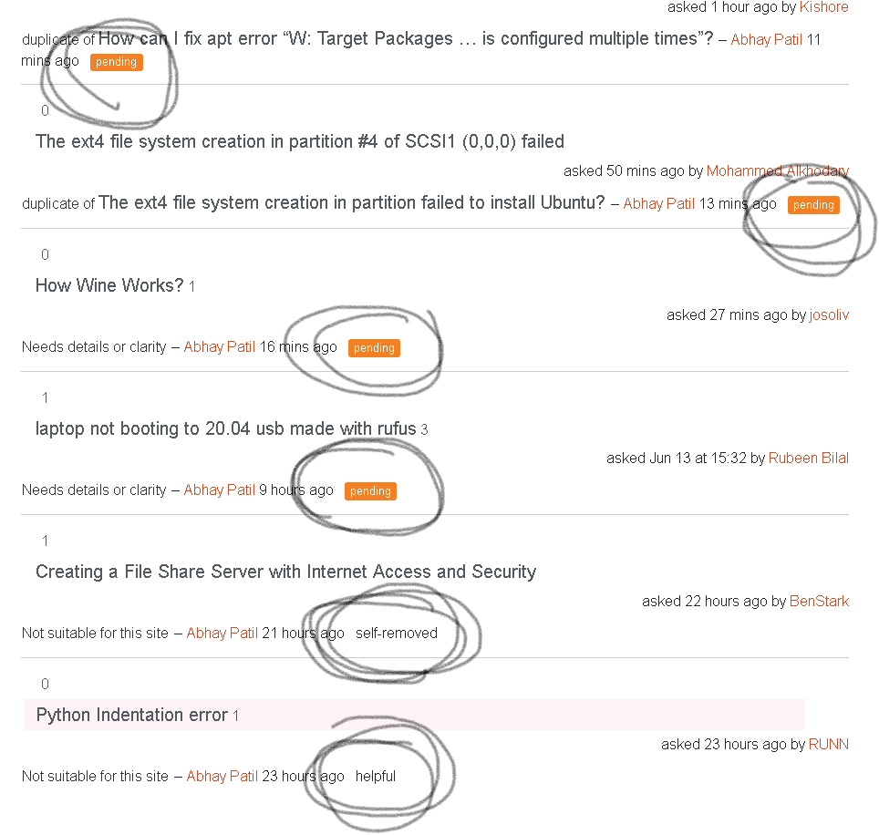
In the flag summary section on a person's profile, it is difficult to differentiate the action of a flag. Although there is a feature to sort the flags' actions, it would be convenient to see them together. Just as the flags to be reviewed are highlighted with bold orange padding, it would be better to see a green background for the accepted flags and a red background for rejected flags.
In the given image just as the pending is in the given orange background, the helpful could have green background, and the self-removed could have a gray padding.
I edited the CSS and HTML files to show how it could look if implemented.


