24

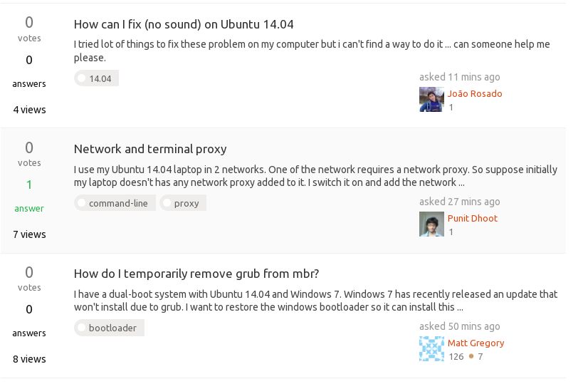
As you can see, Ask Ubuntu community site got a slight design update today. I have moved site's CSS to a newly refactor LESS system, so it's more maintainable for us to fix SE network CSS bugs globally going on forward. I've standardized some common site elements and UI conventions. For example, only accepted answers on the home page and question list page get a more prominent treatment. I have removed the Ubuntu orange color for unanswered background color. (The orange was a bit over used before). I try to keep the overall look and feel the same as before. The new changes will make it easier for us launch new site features as well.

Site's logo and icons are now in SVG for retina support!

This update should retro-actively fix most of the old CSS bugs. If you see any new ones, or old ones not being fixed, please let me know!

28
  • 8
    Thanks for the update!
    – Marco Ceppi Mod
    Commented Apr 6, 2015 at 8:38
  • 1
    I have the feeling code looks much nicer now :) Commented Apr 6, 2015 at 8:44
  • 3
    @JacobVlijm let's just say we trimmed this site's own .css file by 3k+ lines... past me was a noob.
    – Jin
    Commented Apr 6, 2015 at 8:45
  • 7
    I would love to have the orange circle on questions with no answers back. In my opinion it was good to highlight them. If you don't like orange, you could also think of another way, of course...
    – Byte Commander Mod
    Commented Apr 6, 2015 at 10:33
  • 1
    The favorite tags grey background is lost (UPDATE: almost invisible) on questions and editing the favorites put the Add button out of the div (only 10% of it is visible) Commented Apr 6, 2015 at 11:07
  • 2
    Looks a lot better :)
    – Mitch Mod
    Commented Apr 6, 2015 at 11:57
  • 2
    @Jin you've got me wanting to smack things with the printed bash manpage (>300 pages) now with these changes. Blue != orange. Font size is now smaller than it was on the main page, and is annoying on wide-screens or high-res screens. The grey used in place of black is less readable on the main page and in the editing windows for editing answers/questions. Font size overall has been reduced, making it harder to read anything, comments included. And what font did you put on here, it's not playing nice on my 14.04 system. What prompted these changes???
    – Thomas Ward Mod
    Commented Apr 6, 2015 at 13:51
  • 3
    So much hate :-(
    – Seth Mod
    Commented Apr 6, 2015 at 15:02
  • 1
    @kos if this is a "Work in Progress" then it needs to be set up in a staging environment, not in production. Another -1 for incompetency as a result of not using a staging environment as a preview, and just blindly applying to production. BAD DEV CYCLE WORK, JIN!
    – Thomas Ward Mod
    Commented Apr 6, 2015 at 15:30
  • 4
    Meta design functions are bad too. What was previously orange for mod-only tags are now pink. -1 again.
    – Thomas Ward Mod
    Commented Apr 6, 2015 at 15:33
  • 1
    @ThomasW. that's how it is everywhere else on the network. I can understand that they want a more uniform look across SE. For one thing, it would make fixing things much easier.
    – terdon
    Commented Apr 6, 2015 at 15:36
  • 1
    Anyway looks like the font has been adjusted a bit,and now it's much better. Instead, the blue in the boxes now started actively hurting my eyes! :) That's my only complain for now anyway, almost all really looks fine
    – kos
    Commented Apr 6, 2015 at 16:23
  • 2
    @bodhi.zazen It wasn't the disagreement that I was sad about, that always happens. It was the strong and, IMO, inappropriate ways that people have expressed their disagreement that makes me sad.
    – Seth Mod
    Commented Apr 6, 2015 at 18:18
  • 1
    A per Is AskUbuntu boring?, the badges and stuff I think are supposed to be similar to canonical certification icons or something. Thanks for putting the effort in to redesigning stuff, it seems to result in a cleaner UI (albeit with the odd annoying bit :)
    – Wilf
    Commented Apr 7, 2015 at 18:53
  • 3
    Why You added blue color? In my opinion I does not look good with overall orange design. 'Bounty information' with orange background looked way better.
    – kcpr
    Commented Apr 14, 2015 at 15:11

16 Answers 16

14

I can no longer see which questions are tagged with my favorite tags:

example showing a highlighted question

The middle of the three questions shown above is highlighted because it is tagged with one of my favorite tags. Assuming this is not a question of my screen being miscalibrated, I'm sure you agree that the highlight is almost invisible.

The normal background is pure white (#ffffff) and the highlight is #fafafa which is really too similar. Please make this more visible.

4
  • 3
    I'm going to put a fix for this today. The old favorite tag was too dark, but I think I went overboard lightening it. How do you feel about the light yellow I use on Stack Overflow for favorite tag background color?
    – Jin
    Commented Apr 6, 2015 at 14:11
  • 2
    @Jin thanks. I think that the yellow would look out of place here. I suspect that a light orange might fit with the rest of the site better, but you're the designer. If you think it'll look OK with the rest of the site, give it a shot.
    – terdon
    Commented Apr 6, 2015 at 14:14
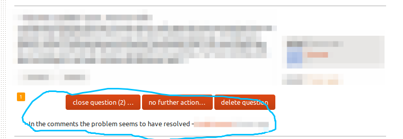
  • The fix is now live. Dunno if we should delete this, edit it or do nothing.
    – Seth Mod
    Commented Apr 8, 2015 at 2:45
  • @Seth see update. That's what I've been seeing on other sites as a way of marking bugs as fixed.
    – terdon
    Commented Apr 8, 2015 at 9:20
11

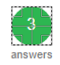
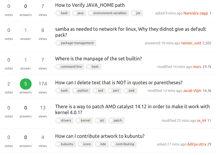
I'm not sure if this is new or not, but I find the green used in the front page to show the number of answers a question hard to read:

enter image description here

Do I need new glasses or is the word answer blurry? Perhaps there's not enough contrast between the foreground green and the background? Or is it an anti-aliasing issue? Either way, could it be fixed please?

8

Posting a screenshot as an "anwser" as an example of the blue hightlight. I would consider changing the color to match the rest of the site.

Feel free to delete this "answer" after you have considered the colors

enter image description here

7
  • 3
    I kinda like the blue highlighting myself :p
    – Seth Mod
    Commented Apr 6, 2015 at 15:03
  • to each their own, it just seem out of place with the rest of the palatte
    – Panther
    Commented Apr 6, 2015 at 15:32
  • 2
    I think the pink mod tags are worse... Just my humble opinion.
    – Elder Geek
    Commented Apr 6, 2015 at 16:24
  • 5
    Ok, after a little while the blue is starting to bother me. It makes things a bit too bright. Maybe they should be orange after all :P
    – Seth Mod
    Commented Apr 6, 2015 at 18:23
  • 2
    How I'd like the squares to be: imgur (#DE4508, matching the navigation bar)
    – kos
    Commented Apr 8, 2015 at 20:35
  • But having seen the new (yellow) labels for the pending flags, I have to say I'd fancy something close to that color either! Or even better something in between the two.
    – kos
    Commented Apr 10, 2015 at 13:52
  • I created a userscript to change it back to orange.
    – Seth Mod
    Commented May 3, 2015 at 16:38
8

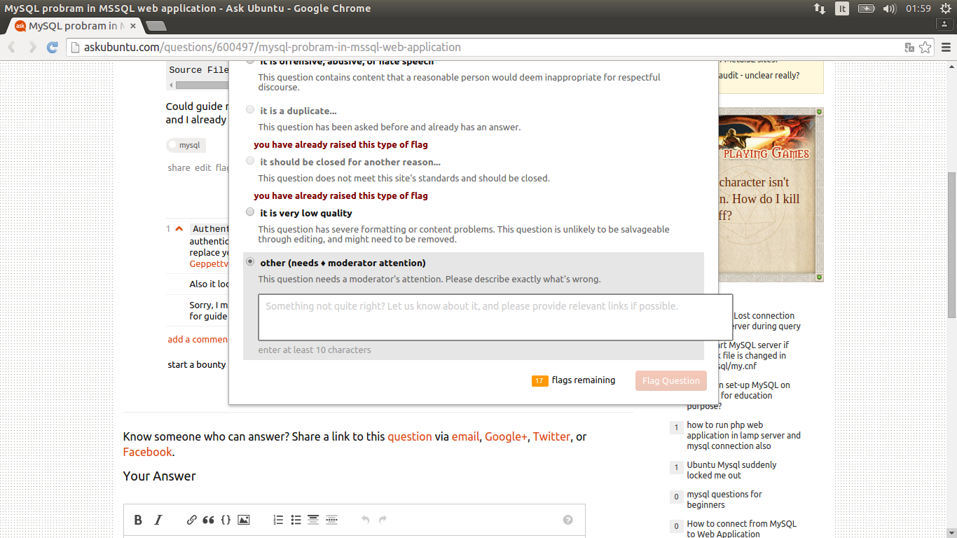
The "other (needs a moderator attention)" flag textbox overflows the "I'm flagging this question because" window

Link to full image on Imgur.com

Image-1

4
  • 4
    Yes, I've noticed this too. I'm using Firefox 37 (37.0+build2-0ubuntu1), in case that's relevant to troubleshooting this bug. Commented Apr 15, 2015 at 3:02
  • 1
    Google Chrome 41.0.2272.118 (64-bit) here
    – kos
    Commented Apr 15, 2015 at 7:54
  • The issue still exists in the revamped flag dialog.
    – Léo Lam
    Commented Apr 26, 2015 at 11:20
  • Same here on Firefox 37
    – Wilf
    Commented Apr 28, 2015 at 8:44
7

Complaints.


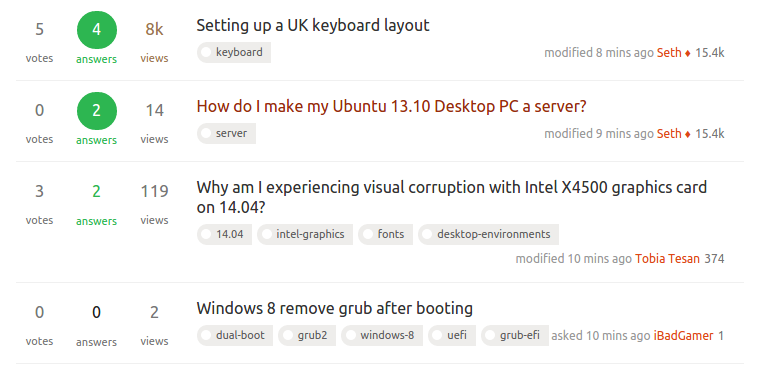
Mod-only flags on meta are now red, instead of orange with white text like it was. Aesthetically it clashes.

Snippet


Multiple complaints here...

  • Font size was reduced, makes it a lot harder to read on high-res screens. This font size reduction is only on the pages here - the actual 'Question size' on the font doesn't change one layer down on the actual questions.
  • No green circle around "2 answers". Affects aesthetics, less so than readability, but it looks garish as is now.
  • No orange border around the "No Answers" items like we had. (Affects readability and aesthetics)

enter image description here


Uniformity needs to give way to aesthetics. While most of my complaints here are aesthetic in nature, you can have 'uniformity' but also include aesthetics with respect to the site theme/design.

2
  • 2
    Good points all....
    – Elder Geek
    Commented Apr 6, 2015 at 16:26
  • Thomas: You should refrain from writing these things when you've had too little sleep: they make you sound like the old cranky fart that I am! ;-)
    – Fabby
    Commented Apr 8, 2015 at 21:01
6

The number of answers circle seems slightly oval (38x40px), and the number is slightly off centre.

enter image description here


enter image description here

1
  • The CSS technique used is to round off the borders off a box shaped element so it becomes round, and setting the height of the box to 34px seems to fix this but break other bits - some of the CSS classes are relevant: .stats .answered strong, .stats .unanswered strong, .stats .answered-accepted strong, .answered-accepted .mini-counts, .answered .mini-counts, .unanswered .mini-counts. I'm not that bothered about the oval but the centring thing is a bit weird. it works anyways.
    – Wilf
    Commented Apr 12, 2015 at 18:35
6

New profile page weirdness:

Underline from hovering over tab headers looks weird with the blue box over the number of unread items:

enter image description here

This is also inconsistent with the overall tab headings, which don't have any underline:

enter image description here

Underline from hovering over the reputation graph looks just plain weird:

enter image description here

2
  • 1
    +1 but what do you think, would it be better to condensate all the issues about the UI here or to ask a new question about the new user profile and user activity pages specific issues?
    – kos
    Commented Apr 16, 2015 at 10:20
  • @kos I don't know. Will there be that many issues with the new profile page? Let's see if Jin responds.
    – muru
    Commented Apr 16, 2015 at 10:30
5

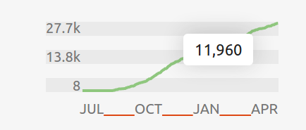
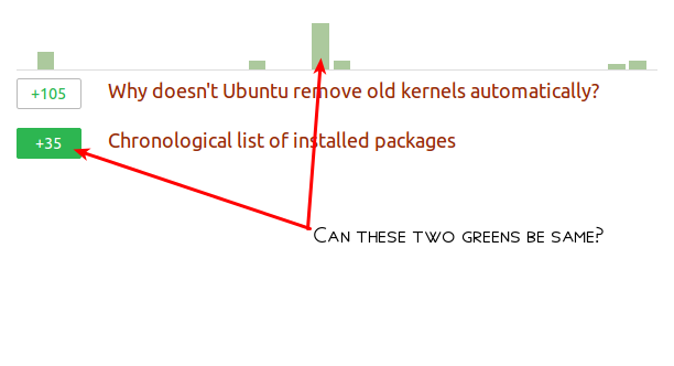
Make the two green colours in the Rep sections same

enter image description here

I feel that the two different shades of green used here do not look aesthetically pretty.(Well, at least in my honest, personal opinion)


Accept tickmark is not properly centered

To me, the tickmark under accepted answer votes, does not look to be properly centered within the circle.
enter image description here
Maybe the tickmark should be just a little bit towards left.

4
  • I think the angle of the checkmark is pretty much centered. Commented Apr 6, 2015 at 19:15
  • 1: I like it that way, it draws the attenction on the latest reputation changes instead that on the summary. 2: As Jacob Vlijm said the mark's angle it's centered on the circle's vertical axis, but I feel like everything would look nicer if the mark's vertical axis was centered on it instead
    – kos
    Commented Apr 7, 2015 at 8:08
  • 1
    I agree that the checkmark is not centered properly. Although the bottom of the checkmark is horizontally centered, I feel like the smallest circle containing the checkmark should be centered within the larger circle instead. Commented Apr 8, 2015 at 13:35
  • Part of these image sprites, probably be easy to fix.
    – Wilf
    Commented Apr 12, 2015 at 18:37
4

The background colour used for the flags in the flag queue is gone which makes the flags hard to read. Could you darken that a bit more, closer to what it used to be?

Another issue I've run into is the contrast between the orange squares and the number they hold makes it really hard to read (this one is quite hard to show in a screenshot, but hopefully it gets the idea across).

enter image description here

I'm personally fond of the colour used but I'm afraid something is going to have to be changed to keep those more readable.

Thanks for all the awesome work you do around here Jin!

2
  1. The font size of the body text in the questions and answers looks larger than it was before on my computer.

  2. The line spacing of the body text looks smaller than it was before.

The combination of these two factors makes the text look too squeezed together. Either increasing the line spacing, decreasing the font size or both together would improve the readability.

2

In short:

I really can't help the fact that I like the overall changes.

  • The less "square" looking font, especially, the
  • Prettier looks of python :) code
  • The less "obsessive" use of orange, bigger variety in use of color(s)

I noticed a few minor changes/improvements were made since this post appeared.

Really, really nice.

2

edit reviews: the suggestion comment is not highlighted any more

The comment from the suggesting person used to be immediately visible (different background IIRC)

Now it doesn't look differently than the restenter image description here

2

The comment upvotes button is much thinner:

New:

enter image description here

Old:

Please go back to chunkier upvotes.

My pronouns are He / Him

1

Bring back some emphasis for questions with 0 answer please

I used to try and do my bit by giving priority to those questions which have no answer at all, and I could see them very very easily when they had that orange circle.

Now it's very hard to easily spot them, and I don't think the argument "too much orange color used in the website" can justify lack of a stronger emphasis for 0 answer questions.

For example, only the number 0 (without a circle) could be made red, or a light grey circle could be used, etc. This problem, I think, will have an adverse effect on the overall number of answers as it puts off people like me. enter image description here

1
0

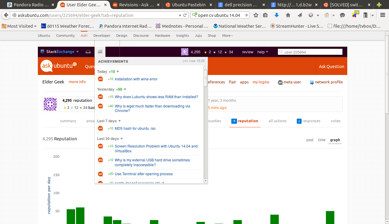
Daily reputation seems inaccurate. I just noticed this:

rep

reputation shows -1 in blue, but achievements shows +10 I'm not certain this is related to the design update, but I couldn't find any related questions so I thought it might be.

2
  • 7
    The design update shouldn't have been able to affect any of the logic going on behind the scenes. I'm guessing caching is at work here too. You might have just needed to reload the page as well.
    – Seth Mod
    Commented Apr 7, 2015 at 17:34
  • 1
    The -1 in blue in the "reputation" tab only shows the reputation change since you last clicked on the tab itself, while the +10 in green in the recent achievements shows always the total day reputation
    – kos
    Commented Apr 15, 2015 at 0:17
-2

We are using pretty quotes in titles here and in Unix & Linux, where it's been pointed out for some time. I get that you wish to clean up code and make things prettier, but please "fix" that which is broken.

11
  • 10
    You have a legitimate complaint here but why are you being so aggressive about it? "-1 for incompetence?" Seriously? Do you have any idea how complex setting up styles for so many different sites is? The SE devs have already stated that they are looking into it and it's been less than 3 weeks. Please be nice and remember that pissing off the people who are making this for you is not the best way of getting it done.
    – terdon
    Commented Apr 6, 2015 at 14:12
  • 1
    @terdon do you know what a 'staging' environment is? They need one next time, rather than changing the production environment.
    – Thomas Ward Mod
    Commented Apr 6, 2015 at 15:33
  • 5
    @ThomasW. we have a test environment and test themes before they go live. This was consciously not changed. We looked at the last several hundred posts and almost all of them are correctly quoted with fancy quotes. Changing the quoting behavior would be a net-negative we don't want to do.
    – Nick Craver Mod
    Commented Apr 6, 2015 at 15:52
  • 4
    @NickCraver this is admittedly a problem for the technical sites. Especially *nix-related ones where quoting is an Issue®. Any chance of changing that at least for AU and U&L? Consider that it breaks copy/pasting since the fancy quotes are not recognized by the shell.
    – terdon
    Commented Apr 6, 2015 at 15:55
  • 3
    @NickCraver as terdon said, fancy quotes use a form of quotes which will explode in a shell / terminal environment - that means that you break the functionality of code pastes which would then be copy-pasted into terminals. As was said, it's an Issue that would detract overall from the site and break a lot of things for people using copy-paste to put code in the terminal to execute.
    – Thomas Ward Mod
    Commented Apr 6, 2015 at 16:02
  • 3
    If you actually expect folks to copy code out of question titles, I'm afraid there are much, much bigger / nastier usability issues we'd have to contend with first, @ThomasW (depending on your browser and platform, this is currently either trivial but poorly documented or frustrating and exceedingly error-prone even in the absence of any character replacements).
    – Shog9
    Commented Apr 6, 2015 at 18:29
  • 1
    @terdon yes, seriously. How else am I supposed to voice my dismay, if I can't use even a meaningless down vote (we are not on Meta Stack Exchange, remember, where votes do count for something)? And I don't care about offending anyone because I don't expect to see this bug fixed anyway.
    – muru
    Commented Apr 6, 2015 at 18:57
  • 4
    @muru it's the incompetence I find excessive, not the fictitious downvote. I'm just saying it's a shame because you raise a valid point but because of the way you stated it, it's getting downvoted. Perhaps you could delete this and post it again as a request instead of an admonishment?
    – terdon
    Commented Apr 6, 2015 at 19:29
  • 1
    @NickCraver I don't expect users to do that, however experience has taught me that users are not inherently bright enough to NOT do such things.
    – Thomas Ward Mod
    Commented Apr 6, 2015 at 21:34
  • 1
    @terdon aargh. This is why I must always include :P.
    – muru
    Commented Apr 6, 2015 at 22:29
  • 2
    @terdon I have cleaned up this post - I'm leaving it as it is, since SE employees have already commented here that this is WONTFIX.
    – muru
    Commented Apr 6, 2015 at 23:15

You must log in to answer this question.

Not the answer you're looking for? Browse other questions tagged .