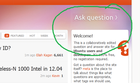
I'm a user familiar with StackOverflow websites but it took me a while to locate the Ask Question button on Ask Ubuntu.
Reason: Insufficient contrast (as can be seen below). A single grey / translucent back background should fix the problem.

I'm a user familiar with StackOverflow websites but it took me a while to locate the Ask Question button on Ask Ubuntu.
Reason: Insufficient contrast (as can be seen below). A single grey / translucent back background should fix the problem.

Here are some mock-ups, of what I was thinking would make the Ask question-
A- more visible
B- In line as a "tool" on the Main bar
My main point is that it seems to be more part of the side bar - then the top primary navigation.
When first searching where to ask a question, people look first to the primary horizontal navigation.
I visited many other Stack Exchange sites, and noticed the main difference is that they have "Ask question" in line with the main bar, below are examples that I feel have a good visibility of the Ask question,
https://sharepoint.stackexchange.com/
https://rpg.stackexchange.com/
https://drupal.stackexchange.com/
https://diy.stackexchange.com/
Notice that they have varying design aesthetics, I think we can improve visibility of the button without sacrificing the look of the site.
Here is a mock-up, using the "Light aubergine" that is used to indicate a "consumer focus", http://design.ubuntu.com/assets/colour-palette

Note that we can keep more space between the orange bar and the questions, sometimes important notes appear in that space. The positioning over the darker color automatically improves contrast.
Or perhaps something more subtle -

Here is an option based on the http://www.ubuntu.com/ site,

If 1 in 20 people coming to the site to get help can't see the button they have to click to get help, that would make this an extremely serious bug.
We don't have to break the aesthetic feel of the site to change this. We can give the text itself more contrast. We could even have a notification bar appear at the top of the screen for new users (well, I think we could do this) reminding them that:
Questions should be asked as questions. Answers should be posted as answers. (I'm not saying we should word it quite like that!)
You can ask a question by pressing that button. When the user hovers the mouse pointer over the notification, the Ask Question button is highlighted.
In effect, this would achieve all the positive effects, and none of the negative effects, of actually having a green hand-drawn circle around the Ask Question button. ;-)
While decisions about this should be made to make the site accessible to users, that would not be the only benefit. Questions posted as answers constitute a substantial commenting and flagging load on users, and the workload for moderators to deal with all these flags is probably rather formidable too.
Finally, we should find out if the Ask Question button, as it is now, is specifically inaccessible to people with certain disabilities. It is critically important that we not conclude it's fine as it is, at least until we have satisfied ourselves that we're not discriminating against people with visual impairments.
Update: the entire header was changed; see: Upcoming site design changes
I like it. I think it's classy.
And really, it looks like plenty of folks have been able to find it so far - only two other sites on the network have more questions asked each day, and one of those is Stack Overflow.
mateo_salta's alternate designs are nice enough, but frankly, I think this is change for the sake of change.
(At start I agreed totally with this idea)
Our Ask Question button kinda fades out a bit and might be hard to find for a new user visiting the page for the first time(s).
Pondering a bit I went to some random sites in SE to check out possible suggestions...
Wow, we have a nice looking Ask Question button compared with other sites, and it looks awesome in the layout!
It's probably easier to find than 75% of the sites I checked:
I agree that we could improve the visibility of the button, the hover effect is nice, but the button could get nicer border to make it more prominent on the main page.
It is my wish that we have a look at some options, without modifying the button so much, but make it more prominent.
While some people may not be able to see the button, 95% of the people out there are able to see it (supported by how many new questions we get in any given time period greater than an hour). Given this, I wouldn't find any logical reason to change the way it is now.
As well...
A single grey / translucent back background should fix the problem
That would take away from the design of the site. Aesthetics are important, and adding a grey or translucent background to the button takes away from the aesthetics (it looks ugly).