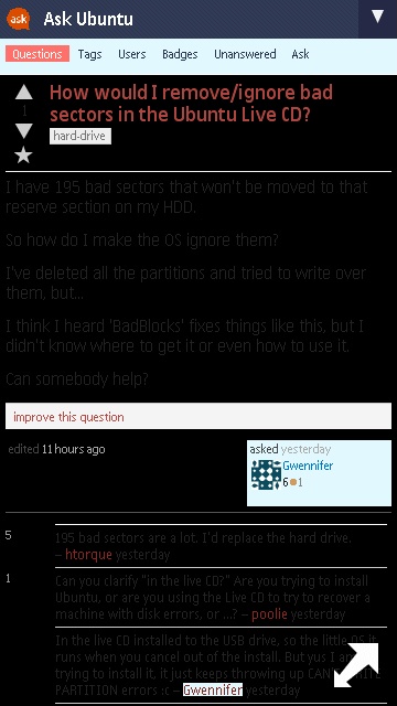
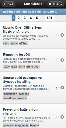
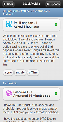
The current askubuntu.com mobile-optimised website uses a black background and a gray foreground(text). This makes it difficult to read and draws attention away from the important part, i.e., the text itself.
Can the colour combination be changed to something more legible, like a white background and a black foreground or a black background and a white foreground?
This is how the website looks on my Nokia 5530 XpressMusic phone:


