1

The Problem

Ask Ubuntu's favicon, that is Ask Ubuntu's favicon http://cdn.sstatic.net/askubuntu/img/favicon.ico, is too similar to the inbox alert. The problem is that when the favicon is placed close to the Stack Exchange menu (the menu in the top left of the site) the favicon might be mistaken for an inbox alert.

An example of this is in Firefox when the tabs are set to appear at the bottom of the top panel and Ask Ubuntu is opened in the leftmost tab. The following might be mistaken for an inbox alert:
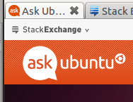
Ask Ubuntu with no inbox alert

That is, the favicon might be mistaken for there being an inbox alert in the Stack Exchange menu. This happens especially for me when looking at it from the corners of my eye and I take it to be due to the Stack Exchange menu appearing very close to the favicon and the favicon being too similar to the favicon. The similarity may be observed when looking at a case where there is a inbox alert:
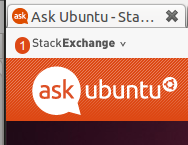
Ask Ubuntu with inbox alert

Notice that if you look a the image above from the corner of your eye the favicon and inbox alert (the red circle with '1' in it) they look identical.

Also note that this also happens when viewing other Stack Exchange sites and the Ask Ubuntu site is in the leftmost tab. Super User:
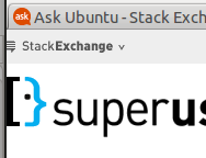
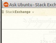
Super User with no inbox alert

tex.stackexchange:

tex.stackexchange with no inbox alert

The question

Does this problem need to be solved? If it needs to be solved, what can be done to solve it?

2
  • 2
    What do you want changed? I don't see a question here. Commented Jul 4, 2011 at 19:37
  • 1
    I'm implying that the Ask Ubuntu's favicon might benefit from having another color or design to make it more distinct from an inbox alert.
    – N.N.
    Commented Jul 4, 2011 at 19:40

3 Answers 3

2

Whilst at first glance I nodded and went "hmm, this isn't ideal", I think it's something you're going to have to live with:

  • Orange is "the Ubuntu colour" - changing the favicon would make little sense from that point of view, and would also detract from the Ask Ubuntu brand that the community has worked hard to establish.
  • At the same time, orange is a useful colour to get attention as is wanted with the inbox alert.

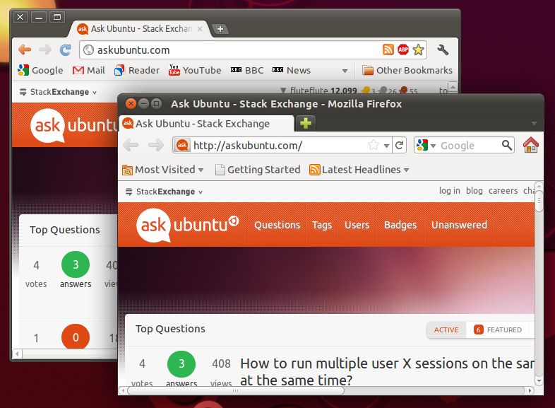
However, what really makes me think that this isn't worth fussing over is best shown in a screenshot:Screenshot of Firefox and Chromium

By default then both Chromium and Firefox (which I think are probably the most common browsers for Ubuntu users) have the URL and navigation bar and bookmarks bar between the tabs and the page content.

Therefore screenshots and situation you described regarding "Firefox when the tabs are set to appear at the bottom of the top panel and Ask Ubuntu is opened in the leftmost tab" is simply very unusual and unlikely to be experienced by most users.

It's not something worth changing.

1
  • True, but IMHO that setup is less efficient because you switch tabs more often than you use the bookmarks toolbar or address field so keeping the tabs closer to the rendered pages makes sense.
    – N.N.
    Commented Jul 5, 2011 at 20:36
0

I would like to suggest that Ask Ubuntu's favicon might benefit from having another color or design to make it more distinct from an inbox alert or that the Stack Exchange menu is changed to make it more distinct from Ask Ubuntu's favicon.

Since Ask Ubuntu's favicon is the only Stack Exchange favicon that I've observed this for and the Stack Exchange menu appears on every Stack Exchange site it seems reasonable that the Ask Ubuntu favicon is changed and not the Stack Exchange menu.

0

Changing the favicon because of such a small issue sounds silly to me. If you need to be notified of new inbox messages, consider the next Stackapps:

If you want to, I can create a userscript that colors the whole bar red on new inbox messages.

You must log in to answer this question.

Not the answer you're looking for? Browse other questions tagged .