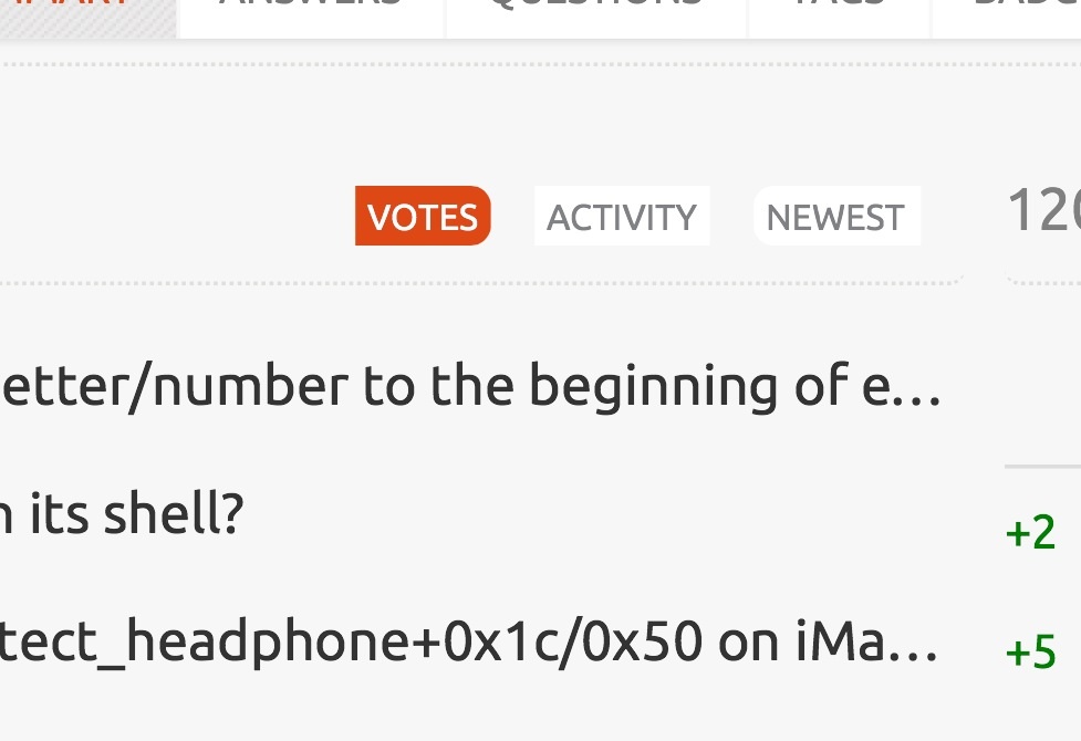
On my main profile page, I noticed this:

Is it just me, or are the tab backgrounds backwards for the left & right ones? Shouldn't the rounded corners be pointed out?
On my main profile page, I noticed this:

Is it just me, or are the tab backgrounds backwards for the left & right ones? Shouldn't the rounded corners be pointed out?
I can't believe it's been wrong this whole time (since the site graduated). I had the border radius backwards. I have fixed it. It will be on live site after the next production build.
I don't think this is by-design. It looks like it was supposed to originally represent a rounded bar so the first item is always rounded on the left and the last item is always rounded on the right. I say this because it would mirror the rest of the compound link bars (like the main tabs bar on the profile page).
There's actually more of a problem than them just being the wrong way around. There's no background or box-shadow like there is on #tabs so even if the rounding was correct, you can't see it because there's no contrast.
@Jin I've tried to make your life easier and I've just mocked up a quick demo of what it should look like with Firebug:

That's accomplished by applying the following overrides:
.subtabs {
    background: none repeat scroll 0 0 rgb(255, 255, 255);
    border-radius: 5px;
    box-shadow: 0 1px 2px rgb(224, 224, 224);
    float: right;
    margin: 5px 10px 5px 0;
    overflow: hidden;
    padding: 0;
    width: 100%;
}
.subtabs a:first-child {
    margin-left: 0 !important;
}
.subtabs a:last-child {
}
There may be some value in scrapping the ends and just having rounded active links, but having teeny little bars on the page isn't as distracting as I thought it might at first.