A lot of the questions asked nowadays are purely tech support questions - people dump a crash log or error message on us, give us little information about what they are even trying to do, and then expect us to find a solution for them. Mostly, these users don't stay or come back either, and just want their "question" answered. This, of course, hurts the site: We get a lot of low quality questions, and due to some of our shortcomings with closures, these questions stick around despite being utterly useless for us.
#Idea here
Let's make changes to what people see when they actually go in intending to ask a cruddy "question".
We won't get anywhere unless we try to communicate information to our valued custom - AHEM the site visitors who want to ask a question.
There are changes we can make in the short-term (low-effort) to make some serious headway into solving the "tech-support" image and increase our question quality. (As Oli said, we are tech support, but we're drowning in impossible requests made by uninformed posters.)
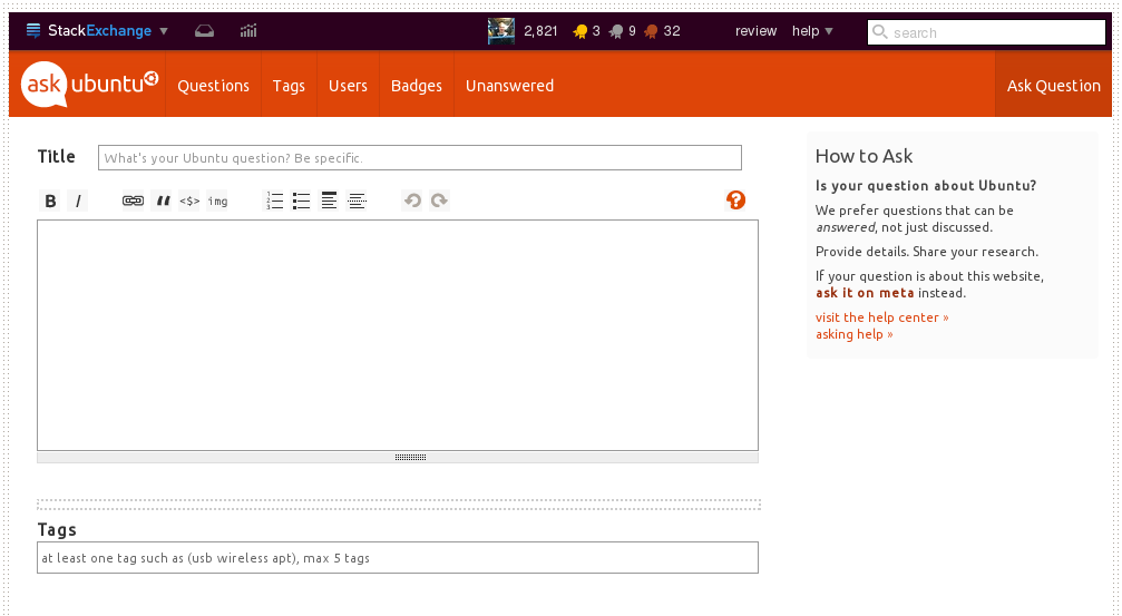
Here's something that could be a huge part of the issue - This is all you see when you go to ask a "question".
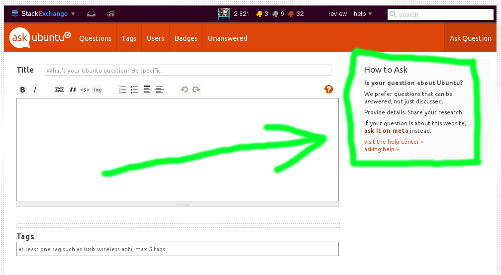
The one problem that we could easily solve that I'm betting will make a noticeable impact on the rate at which we see undesirable "questions" pop on the site concerns the "How to Ask" box:
This box of information has issues. It is the only thing new askers can rely upon to guide them into making informed decisions about creating a question. While its information may be correct...
- It is located on the right side of the interface. Anyone in advertising knows that ads on the left side of the screen should always cost more than ads on the right side of the screen, because it has been proven that the human brain works in such a way that, when a person uses their brain to understand a website, it pays sooner and greater attention to the items and ads on the left (source: American Psychological Association). It has been theorized that this is because most people are trained to read from left to right. The same thing applies here because we are trying to communicate with people. So when people are going to ask a new question, they aren't thinking "Wait, I better read this thing about how to ask first...", they are thinking "TITLE! Let's get it started!"
- So maybe the box should be moved to the left. But even then, most people seeking "tech support" will want to breeze past it and not pay much attention, opting instead to focus on their question which is of course the most important thing in the world and trumps any sort of reasonable guideline. We need to have the information in the box spread out across the page in noticeable places. When an asker clicks on the three page elements they are certain to click on (namely the "Title" box, Tag box, and question body editor) there should be some sort of informational, Yahoo! Answers-style box indicating these expectations outlined in the box (like indication of research). This kind of notification should verge on annoying, but the point is we need something to be click-activated and, if possible, moving, to let the asker know what the question expectations are.
- The "asking help >>" link is nearly unnoticeable. The font size should be increased for this and the other things in the box.
- The actual content of the box needs to be improved (see below). We should be urging askers to put important information in their questions, not treating them as if they are slow in thinking and taking an unintrusive, non-specific tone.
Moving on. The grey text reading "What's your Ubuntu Question? Be specific." needs to change. It's kind of useless and longish to read, and "Be specific" can mean many things to many different people ("Specifically how angry I am?"). Also, "What's your Ubuntu question?" is redundant.
- We should change it to something that would actually get the asker to pay attention to some guidelines, yet retain the polite tone: "The more specific, the better.", for example. I'm sure there would be better examples, but what we have now could be improved.
- We should have some grey text in the question editing box; it seems awfully blank and having some there would help improve and at least get people to think before they type. This would work best as a list of blurbs. For example: " _ Help us help you - provide as much detail as possible. _ Do a thorough search before posting - your question is likely answered somewhere else. _ Make sure to provide lots of technical details in your hardware-related question. _ Use proper formatting for code and quotes, grammar and punctuation; neatness counts!" This text would, of course, disappear once the box is clicked.
- The "Tags" box grey text could also be refocused so people really think about the tags they put in. "Use tags as specifically as possible. (Max 5 tags)" or "For best results, use detailed tags. (Max 5 tags)".
###Those are some things that we can easily do to improve the interface and gear it towards what we need to communicate to new askers.
The way I see it, we won't get anywhere at all unless we actually look at the source of the problem and make decisions now about fixing it. What do new users know about asking questions? Practically nothing. It is our responsibility to take care of that, inform them, and not complain about a problem that we really can and should solve on our own.
Some long-term ideas I will briefly list here because they involve more work than we are currently willing to put in:
- Make a wizard everyone has to go through before they ask a new question, as was attempted last year (can't find it now).
- Links to meta questions (in a noticeable place) about what exact details should be added in to hardware questions.
- Improving the AU search engine to provide better dupe results and overall search results.
The main issue here is that we need to communicate to the site visitors more clearly, using tried and true methods by other websites such as Yahoo! Answers and other SE sites. Right now, SE in general is too easygoing and non-intrusive in their user communication philosophy for a site like AU. Rethinking these in the ways mentioned above would make a difference.


