18

Recently, well, maybe not too recently, we saw the Ubuntu homepage get a new look. Linked here. I'm also throwing an image below comparing the two if you don't want to go through the trouble of getting to the actual site.

Screenshot

Image is a little small, but essentially they removes the lines in the title bar, moved some icons, and re-named some menus. Gave everything a softer feel.

In short, it looks like we're a little behind the times. Not too big of a change, but OMG!Ubuntu covered the revamp not too long ago.

Is it time for a website upgrade to follow the previous theme of: We look like the Ubuntu website? Or should we keep what's familiar?

5
  • 4
    It's underway, according to Jin. Patience.
    – user98085
    May 15, 2013 at 1:22
  • 1
    Thanks! I hadn't heard anything after searching around and after a look in the FAQ, I decided to throw something here. May 15, 2013 at 1:23
  • 3
    Yeh, I think he only said that on the chat. Here we go.
    – user98085
    May 15, 2013 at 1:28
  • Should I get rid of the question then since we really don't need it? May 15, 2013 at 1:29
  • 4
    Nah. Keep it. We could use it to have Jin respond with a list of changes or whatever.
    – user98085
    May 15, 2013 at 1:30

1 Answer 1

25

Yes.

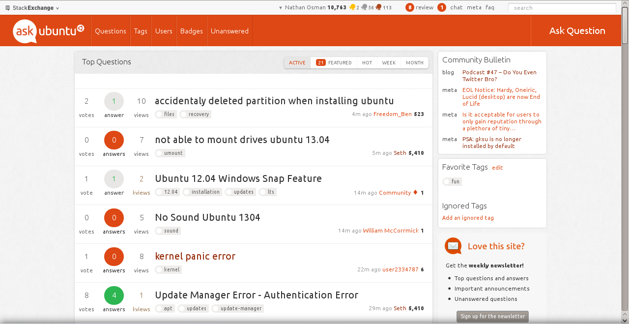
And I have decided to take some initiative. Presenting...

enter image description here

It's still a work in progress, but it makes a huge difference if you ask me. Want to give it a try? Of course you do!

I have packaged the whole thing up as a UserScript which you can install here:

http://files.quickmediasolutions.com/userscripts/autheme/au_theme.user.js

Feedback is welcome!

9
  • 1
    Wow! I love that!
    – Seth
    May 15, 2013 at 3:26
  • 2
    Perfect. Seamless to Ubuntu website
    – Aryo Adhi
    May 15, 2013 at 8:29
  • 3
    I don't like that the top bar is so fluid when the rest of the site isn't. Ubuntu.com doesn't have a fluid top car and neither should Ask Ubuntu (considering both layouts are fixed) May 15, 2013 at 11:54
  • 4
    +1 because ,now ask question button is more visible. Ie it will solve well known usability bug
    – Tachyons
    May 16, 2013 at 0:26
  • @Nathan Osman, Where can I provide the usage feedback?
    – saji89
    May 20, 2013 at 9:47
  • @saji89: Right here is fine. May 20, 2013 at 16:29
  • Just looking at the picture, the search bar could be incorporated into the orange bar (to the left of the 'Ask Question' button?) for EVEN MOAR consistency.
    – Ads20000
    May 21, 2013 at 16:11
  • 2
    @Ads20000 I think it's better the way it is. We already need the white bar for the Global inbox and username, and I think it would look weird having the search bar next to the ask question button..
    – Seth
    May 21, 2013 at 21:15
  • Very nice @NathanOsman! The script (run through GreaseMonkey on Firefox) is tremendous. Could use a little tweaking here and there, but overall I love it! Hope they at least take a little bit of an idea from your work! May 28, 2013 at 17:33

You must log in to answer this question.

Not the answer you're looking for? Browse other questions tagged .