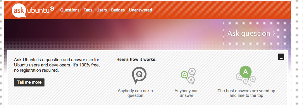
Just noticed the unaligned borders in the navigation bar of the website.
In Firefox:

Also in Chrome:

I don't know if this question fits in meta askubuntu, but is it a bug or just a style?
Just noticed the unaligned borders in the navigation bar of the website.
In Firefox:

Also in Chrome:

I don't know if this question fits in meta askubuntu, but is it a bug or just a style?
I updated the divider borders using CSS only last night, but the updated background image(without borders) didn't get updated due to caching. It will be fixed after our next production build.
I had to implement the borders as part of the image before because I wanted to stay true to Canonical's designer's work. At the time when the design launched, I didn't feel comfortable using rgba() due to browser support at the time.
But really, it's just godawfuldesign.
The bright borders are part of the background:

The dark borders, on the other hand, are defined in the CSS:
.nav li {
    border-left: 1px solid rgba(160, 50, 10, 0.3);
    float: left;
    margin: 0;
    padding: 0;
}
These don't align properly (yay boxmodel, random changes and stuff like that) and as such, this bug occurs.
Maybe we can just nix the Background borders.
And Move the Ask Question into the navigation, Since they will be fixing other parts of the design as well...

Notice that a line was added in-front of "Ask Question" that looks like a divider meant for the top bar:

Here is a version of the background without the lines,

Do you think it had anything to do with adding the bar for new users? Makes the extra space look even worse.

And finally what it looks like without the background lines:
