added 217 characters in body
Source Link
cocomac
  • 3.7k
  • 8
  • 41

On the mobile site, it takes up a large amount of space - can something be done so it takes up less of the page? Maybe put the AWS logo on the same line as Ask Ubuntu?

I find the amount of space it takes up on mobile to be annoying (and consider it gives me no useful information, I don’t need it taking up that much of the page

Itsponsored-by message is on the same line in the desktop siteannoyingly big and looks like a banner ad. Turns out this affects multiple sites, so I assumeI've moved this was simply an oversight. If it helpsto Meta SE, I’m using Microsoft Edgebut as my mobile browserI've gotten some votes here, I'll keep this answer around as a pointer to there
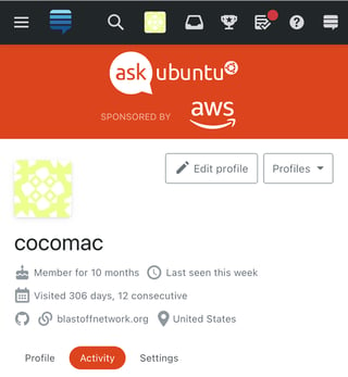
AU screenshot from Edge browser on mobileCan the "Sponsored by AWS" message made smaller (less annoying)?

On the mobile site, it takes up a large amount of space - can something be done so it takes up less of the page? Maybe put the AWS logo on the same line as Ask Ubuntu?

I find the amount of space it takes up on mobile to be annoying (and consider it gives me no useful information, I don’t need it taking up that much of the page.

It is on the same line in the desktop site, so I assume this was simply an oversight. If it helps, I’m using Microsoft Edge as my mobile browser

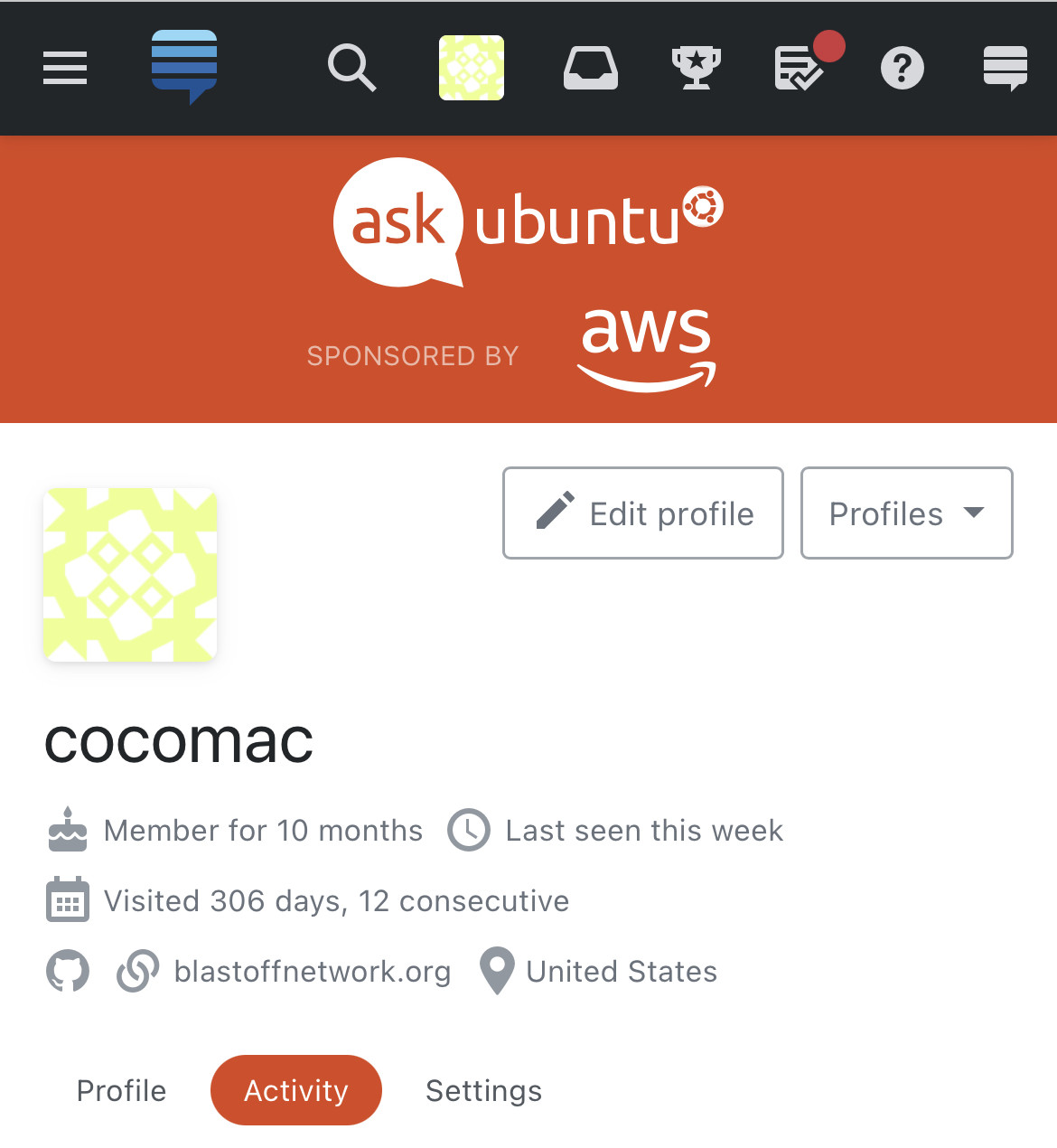
On the mobile site, it takes up a large amount of space - can something be done so it takes up less of the page? Maybe put the AWS logo on the same line as Ask Ubuntu?

I find the amount of space it takes up on mobile to be annoying (and consider it gives me no useful information, I don’t need it taking up that much of the page

It is on the same line in the desktop site, so I assume this was simply an oversight. If it helps, I’m using Microsoft Edge as my mobile browser

AU screenshot from Edge browser on mobile

AWS sponsored-by message is annoyingly big and looks like a banner ad. Turns out this affects multiple sites, so I've moved this to Meta SE, but as I've gotten some votes here, I'll keep this answer around as a pointer to there

Can the "Sponsored by AWS" message made smaller (less annoying)?

On the mobile site, it takes up a large amount of space - can something be done so it takes up less of the page? Maybe put the AWS logo on the same line as Ask Ubuntu?

I find the amount of space it takes up on mobile to be annoying (and consider it gives me no useful information, I don’t need it taking up that much of the page.

It is on the same line in the desktop site, so I assume this was simply an oversight. If it helps, I’m using Microsoft Edge as my mobile browser

changed screenshot to be of smaller size in text but larger on click as suggested by @RandomPerson in chat (https://chat.stackexchange.com/transcript/message/61652977#61652977)
Source Link

On the mobile site, it takes up a large amount of space - can something be done so it takes up less of the page? Maybe put the AWS logo on the same line as Ask Ubuntu?

I find the amount of space it takes up on mobile to be annoying (and consider it gives me no useful information, I don’t need it taking up that much of the page

It is on the same line in the desktop site, so I assume this was simply an oversight. If it helps, I’m using Microsoft Edge as my mobile browser

AU screenshot from Edge browser on mobileAU screenshot from Edge browser on mobile

On the mobile site, it takes up a large amount of space - can something be done so it takes up less of the page? Maybe put the AWS logo on the same line as Ask Ubuntu?

I find the amount of space it takes up on mobile to be annoying (and consider it gives me no useful information, I don’t need it taking up that much of the page

It is on the same line in the desktop site, so I assume this was simply an oversight. If it helps, I’m using Microsoft Edge as my mobile browser

AU screenshot from Edge browser on mobile

added image description; used smaller version of screenshot
Source Link

On the mobile site, it takes up a large amount of space - can something be done so it takes up less of the page? Maybe put the AWS logo on the same line as Ask Ubuntu?

I find the amount of space it takes up on mobile to be annoying (and consider it gives me no useful information, I don’t need it taking up that much of the page

It is on the same line in the desktop site, so I assume this was simply an oversight. If it helps, I’m using Microsoft Edge as my mobile browser

enter image description hereAU screenshot from Edge browser on mobile

On the mobile site, it takes up a large amount of space - can something be done so it takes up less of the page? Maybe put the AWS logo on the same line as Ask Ubuntu?

I find the amount of space it takes up on mobile to be annoying (and consider it gives me no useful information, I don’t need it taking up that much of the page

It is on the same line in the desktop site, so I assume this was simply an oversight. If it helps, I’m using Microsoft Edge as my mobile browser

enter image description here

On the mobile site, it takes up a large amount of space - can something be done so it takes up less of the page? Maybe put the AWS logo on the same line as Ask Ubuntu?

I find the amount of space it takes up on mobile to be annoying (and consider it gives me no useful information, I don’t need it taking up that much of the page

It is on the same line in the desktop site, so I assume this was simply an oversight. If it helps, I’m using Microsoft Edge as my mobile browser

AU screenshot from Edge browser on mobile

Source Link
cocomac
  • 3.7k
  • 8
  • 41
Loading