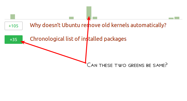
Make the two green colours in the Rep sections same

I feel that the two different shades of green used here do not look aesthetically pretty.(Well, at least in my honest, personal opinion)
Accept tickmark is not properly centered
To me, the tickmark under accepted answer votes, does not look to be properly centered within the circle.

Maybe the tickmark should be just a little bit towards left.
